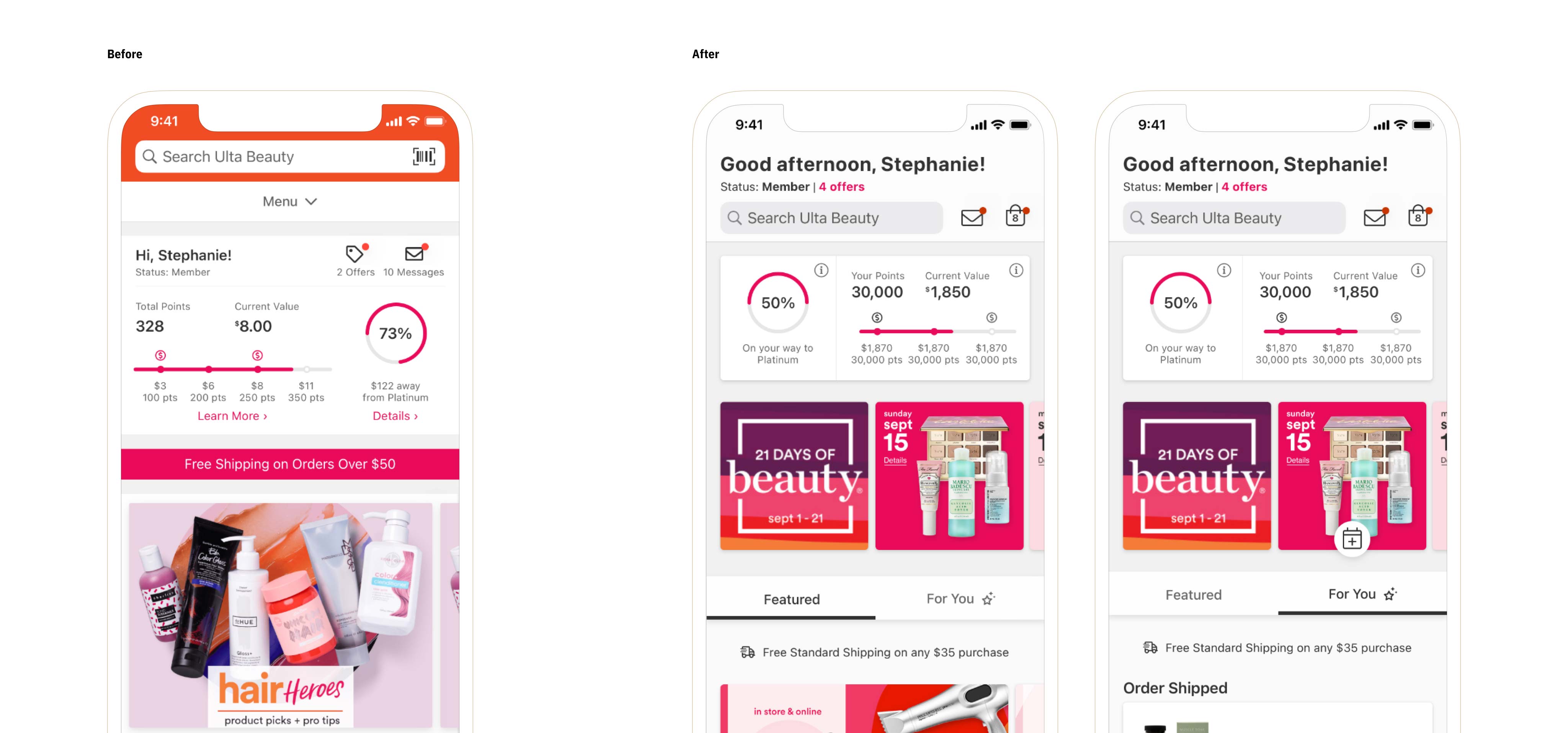
Homepage 2.0
With new business objectives and user needs evolving, the time had come to iterate on the Ulta Beauty app homepage once again.
Details
Platform
iOS
Android
Impacts
Inbox
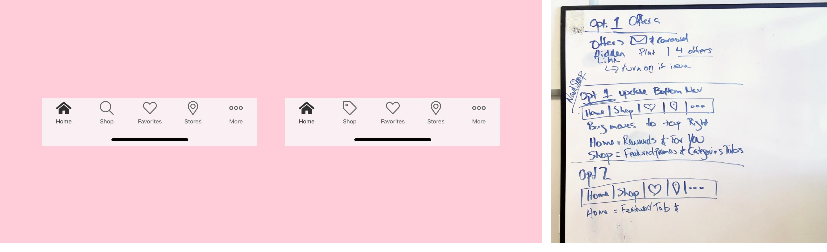
Navigation
"More" Tab
Role
UX Design
Visual Design
Interaction Design
Research
Core Team
Shaun Toomey
Tony Dakhoul
Robert Figueras
Stephanie Chen
Opportunity
Ulta Beauty's rapidly growing eComm business sparked new objectives that sought to position the Ulta Beauty app as the go to platform for its Ultamate Rewards members. This user segment was not only the app's largest group of users but also the most engaged. See the Rewards 2.0 case study for more details on this objective.
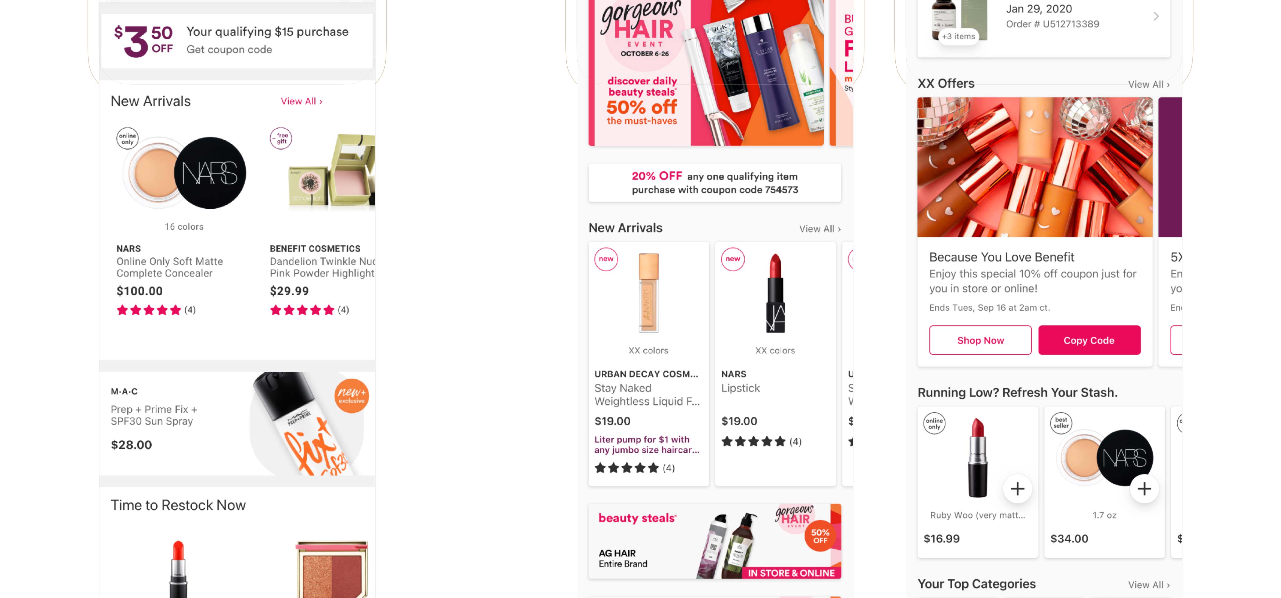
Another requirement came from the marketing team. They voiced a need for new home page modules that allowed them to design content that aligned better with Ulta Beauty’s recently redesigned brand.
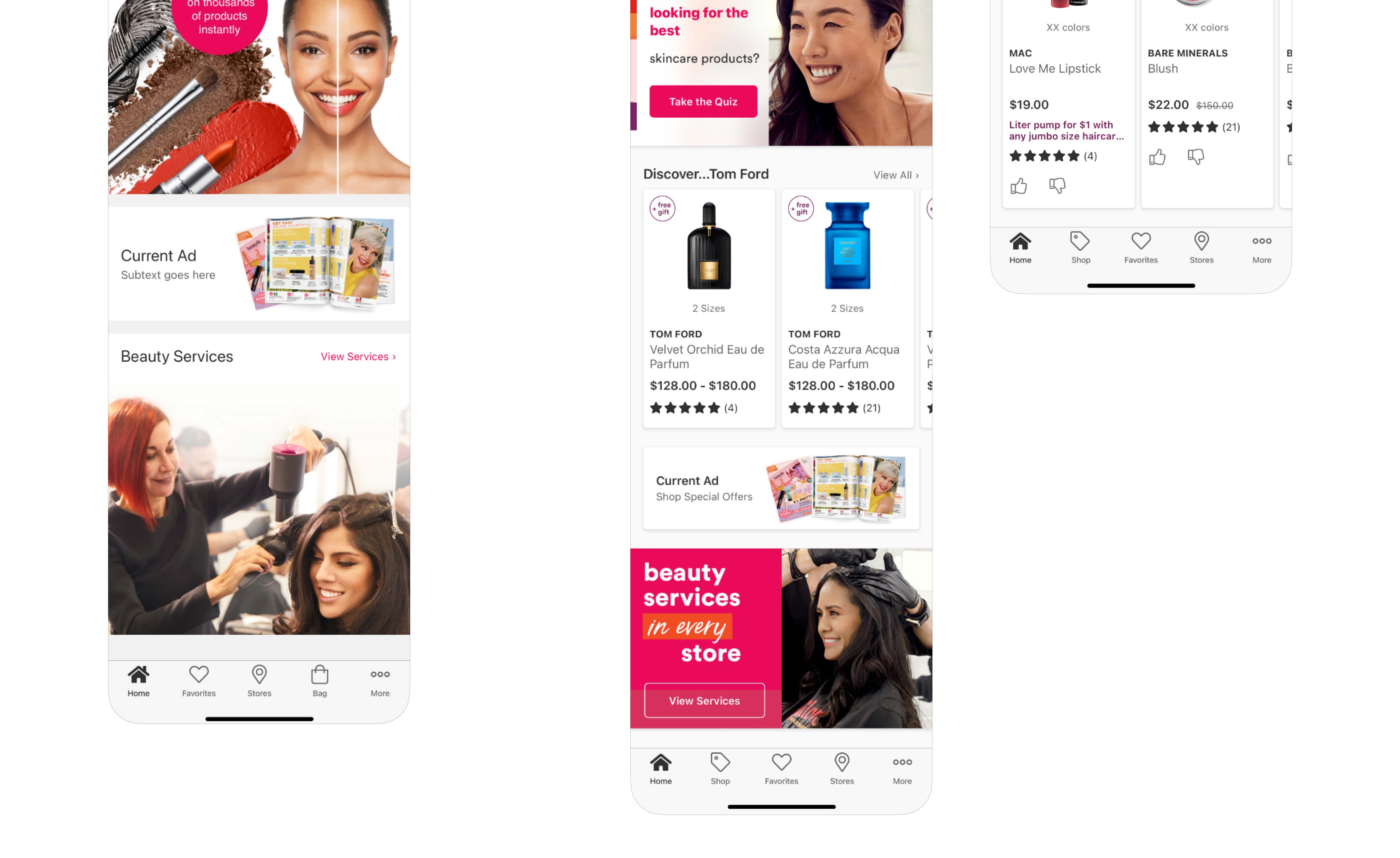
Leadership also asked the app team to build on existing omni-channel initiatives and requested that an "in-store" mode be included in the update to home page. See the In-Store case study for more details on this objective (coming soon).
Research
Many usability tests were run leveraging our existing panel of app users. This allowed us to better understand where the current homepage was excelling and where we had opportunities to improve it. Statements like “Ulta should already know what I like and offer it to me”, were consistently being vocalized in the sessions. As the test results were compiled a few other themes began to form around guest expectations of the home page, which included: discoverability of money saving promotions and offers, product replenishment and new product discovery with a focus on relevance to personal preference.
With Ulta Beauty's acquisition of QM Scientific's AI platform, Quasi, integrating Quasi's personalization engine into the home page was another opportunity to meet guest's growing expectation for personalized content. Ulta guests were letting us know that they each had individual preferences, needs, interest and buying patterns. The existing home page content was geared towards generic promotions for everyone rather than personalized recommendations or offers specific to each guest or segment.
Solution
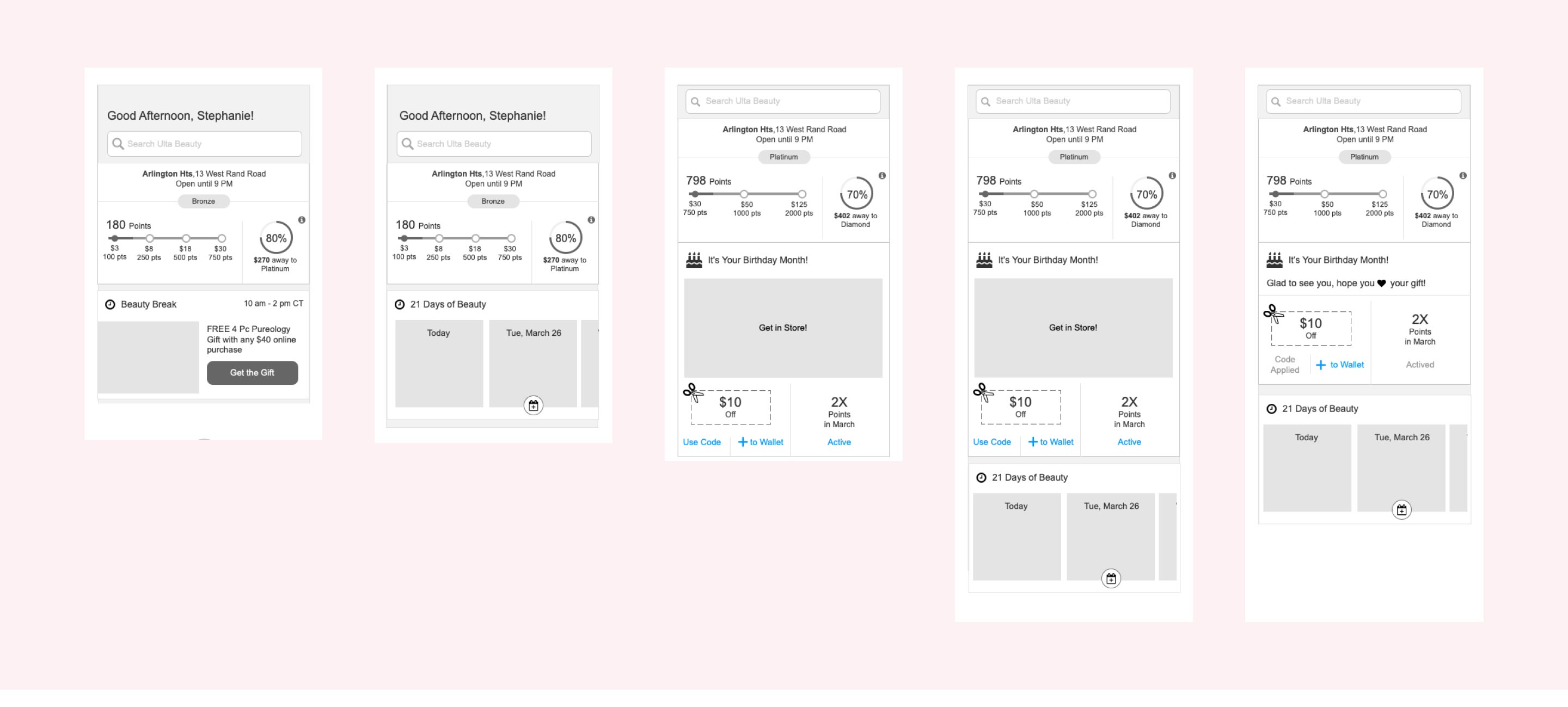
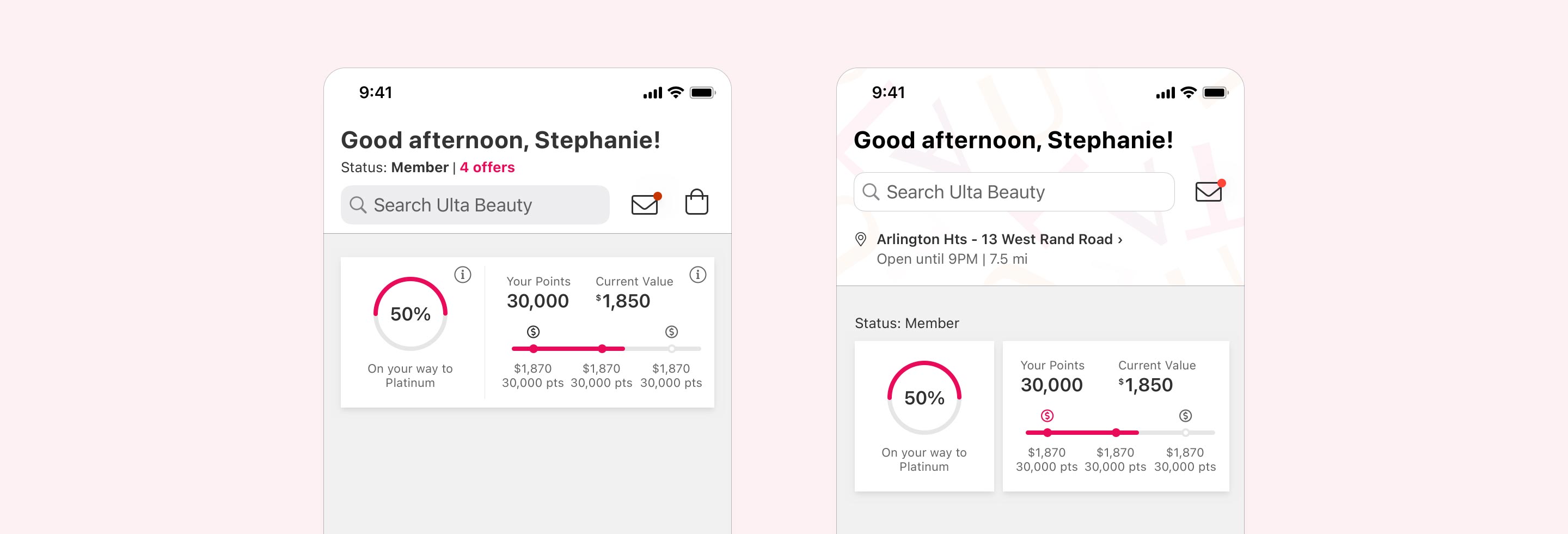
With this release the app team strived to iterate on the previously redesigned homepage, expanding on the foundation that had been built rather than completely starting from scratch. The loyalty module from Rewards 2.0 got a minor iteration to better communicate loyalty status, tier level and current points balance.
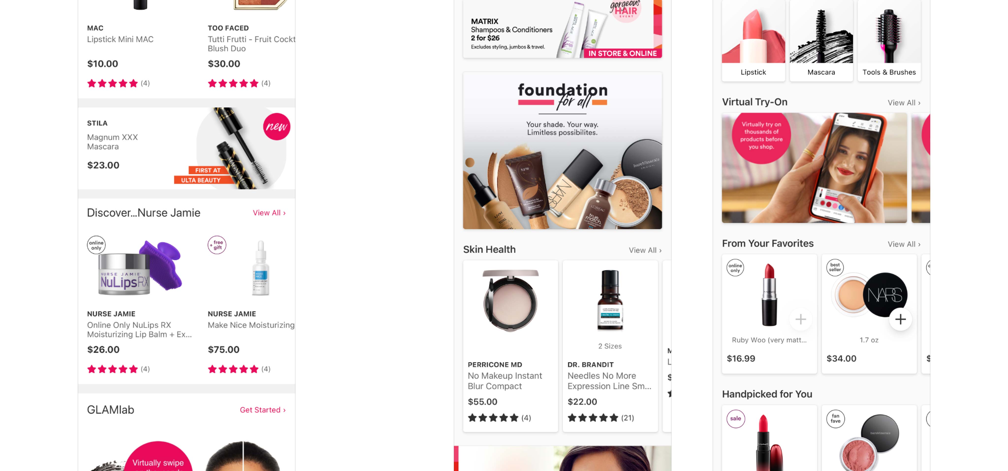
Homepage modules dynamically display personalized content based on guest browsing and purchasing behavior, while balancing merchandising and promotional strategies.
The entire visual design for homepage and navigation were updated to better align with Ulta's recently updated brand. These updated visuals set the stage for future iterations where theming and dark mode support would be integrated.
Love the ULTA app! 😍
I could spend hours on this app...It’s super easy to find what you need and even easier to have it shipped right to your door, or schedule an in-store pick up. This is definitely one of my favorite stores, having the app just makes it even cooler!