Search
Search redesign began with the intention of making a highly used feature not only more helpful, but easier to use.
Details
Platform
iOS
Android
Impacts
Navigation
Homepage
Role
UX Design
Visual Design
Interaction Design
Core Team
Shaun Toomey
Nicholas Eby
Stephanie Chen
Opportunity
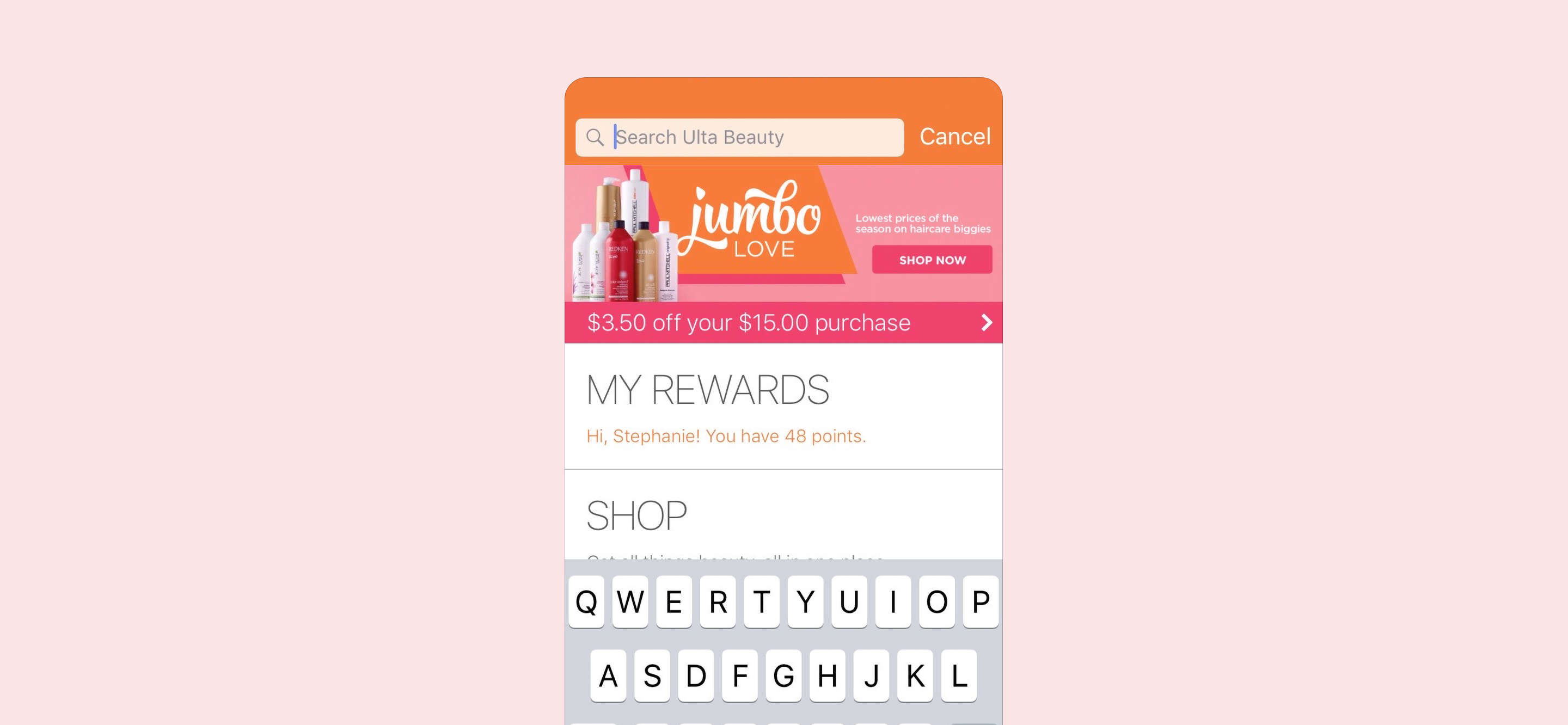
As with most of the app clickstreams at this time, there hadn’t been any alterations or improvements to them in years. Search was very rudimentary in it’s functionality. It offered no suggestions, no history of search terms and no intelligent sorting of results based on a guest's entry.
A number of usability issues were present within the existing search implementation. One of which, kept guests trapped in the initiated search view with only one way of dismissing it.

Research
While doing research for the previous homepage project, we partnered with the customer insights team to better understand the mindsets that guests had while shopping within the Ulta Beauty ecosystem. This partnership revealed four main customer segments. Two of the four groups made up a majority of the traffic entering Search.
The first group of guests who interacted with Search were the Mission-focused Shoppers. This group knew exactly what they were after and were focused on purchasing it. The second group were Beauty Enthusiast Explorers. They were prone to browsing and exploring items relevant to the items they already knew and loved. Our objectives needed to showcase results that were relevant and beneficial for both of these mindsets.

Objectives
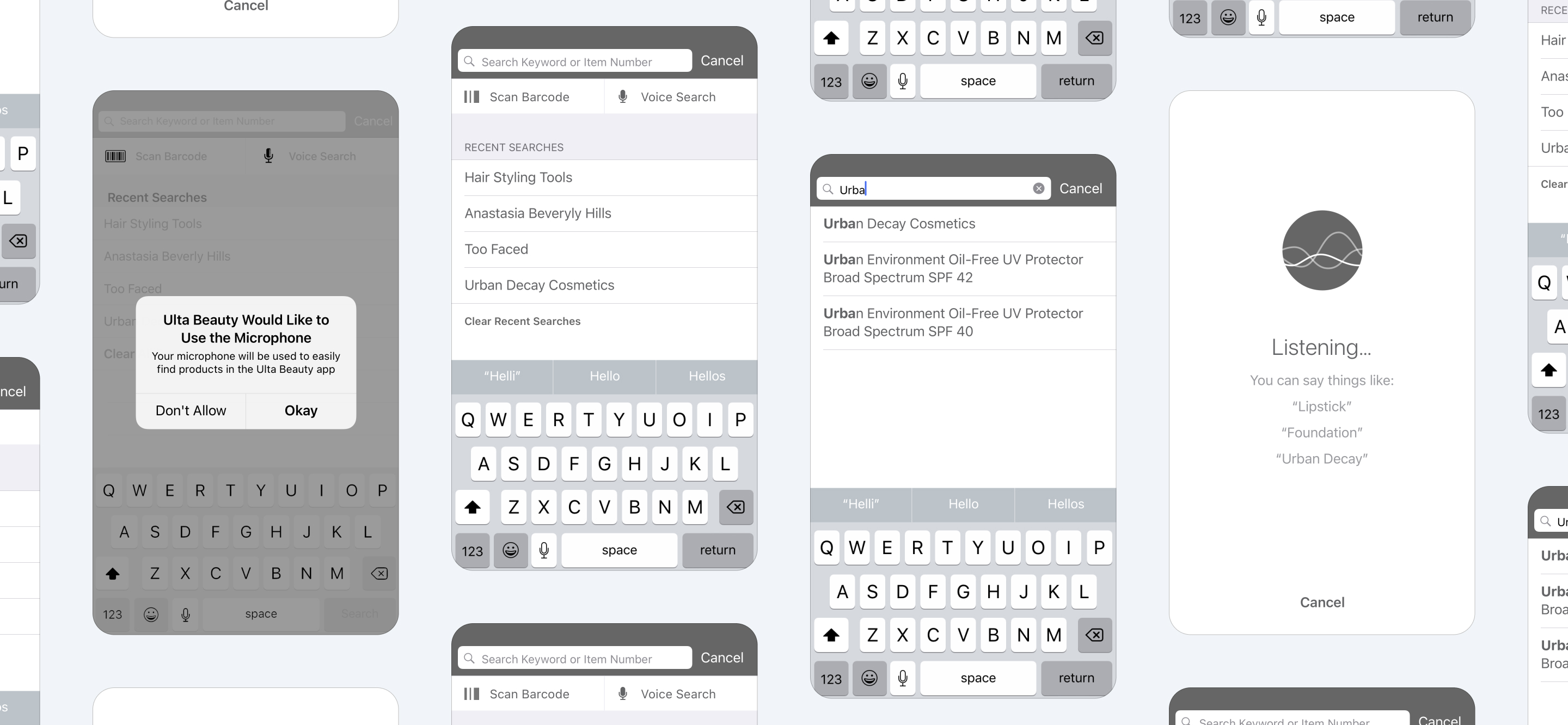
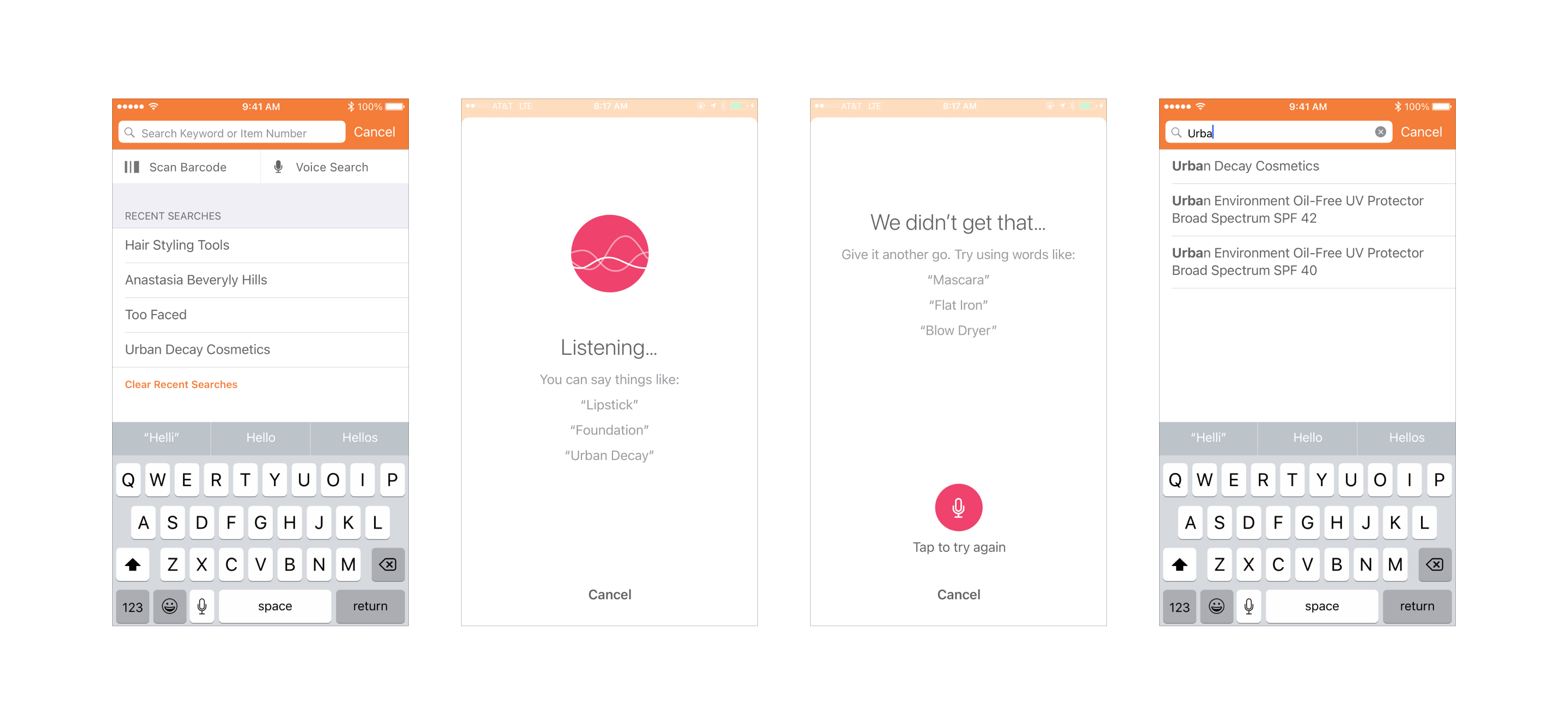
- Add search suggestions based on text entry
- Surface the most relevant results first
- Add ability to search by voice
- Add ability to search by barcode scan
- Leverage native search views
- Reduce search bounce
- Increase purchase conversion
- Increase average cart value
Solution
